Your digital menu is your hardest working salesperson, but if you don't know how many customers are viewing your menu, and how many are dropping off, you’re flying blind.
Conversion is the percentage of people who visit your menu and actually complete an order. Improving this by a small margin (e.g., from 50% to 55%) can result in thousands of dollars in extra revenue each month without needing to find a single new customer.
Get started
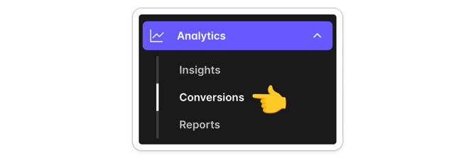
Head to Back Office ➜ Analytics ➜ Conversions
Web only 🌐 These analytics are based on customers browsing your menu in a web browser, on mobile or desktop. This would include customers who open your ordering link, or scan a QR code. Traffic from mobile apps on iOS and Android will be added in a future update.
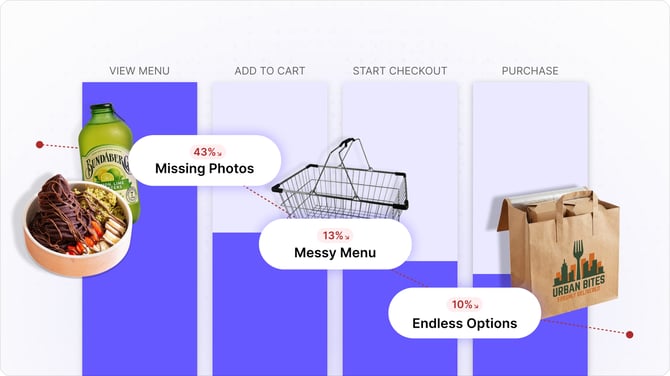
Ordering Journey (Funnel Chart)
This chart tracks the health of your sales process. It breaks down the customer ordering journey into four key stages:
-
View Menu: The total number of customers who opened your menu.
-
Add to Cart: Customers who found something they liked and added to cart.
-
Start Checkout: Customers who continued to make payment.
-
Purchase: Success. The number of people who placed an order.
Under each step of the journey, you can see how many customers completed the step, and how many dropped off before completing the step. The % amounts shown are all relative to the total menu views, so you can see the incremental drop off along the way.
What does good look like? ✅
This menu is performing well – 58% of all menu views convert to make a purchase. A key driver is the high engagement rate – 65% of customers add an item to their cart. Across the Bopple platform, more than 90% of customers who add an item to their cart go on to complete their order, so the high "add to cart" rate on this menu is a major strength.

What does a problem look like? 🚨
On this menu only 8.8% of menu views convert to make a purchase, with more than 85% drop-off before add to cart. This menu is causing a significant amount of lost revenue potential for the business, and there are likely some very obvious improvements that could be made to drastically improve this.

Missed Revenue
This chart puts a price tag on the customers who are leaving your menu before ordering, so you can easily understand the missed opportunity.
-
Missed Revenue ($): This is the estimated amount of potential revenue lost because of orders that were started but never completed. It is calculated based on your average order value and the number of customers who dropped off.
-
Trend Line: This shows missed revenue over the selected time period. It helps you see if marketing campaigns or menu changes are actually moving the needle. Hover over the chart to see the missed revenue for specific dates.
Why it matters: Missed Revenue is an opportunity. It represents the low-hanging fruit of customers who were already interested in your food or drinks but needed a better menu experience to convert from a view to a purchase.

Taking action
Data is only useful if you act on it. If your conversion rate isn't where you want it to be, check out our dedicated guides:
-
Marketing checklist ➜ How to get more eyes on your menu.
-
Menu setup cheat sheet ➜ How to tweak your menu setup to close more sales.
Got questions? Start a live chat 💬 with our team below. We're happy to take a look at your menu or marketing plan and share some guidance maximising your menu traffic and conversions.